
Is a Record $1.2 Trillion in Credit Card Debt a Conern?
Americans now owe a record $1.26 trillion on their credit cards. You may have probably seen some version of that headline on the news. It sounds alarming, and it is meant to. A number that big, sitting all by itself, does exactly what it was built to do. It makes you a little nervous about the state of the world and a little more likely to click.
As I’ve written before, most of the figures cited in the news are a single stand-alone number. “The Dow Sheds 500 points, ”Over 1,000 violent crimes reported in Northern Virginia,” and “US Household Credit Card Debt Hits $1.2 Trillion“ all lack perspective. If the Dow Sheds 500 points, what is the total Dow? If there were 1,000 violent crimes, is that crime figure higher or lower than last year? If credit card debt hit $1.2 trillion, what percent of household net worth is it?
One of my favorite books, Factfulness, by Hans Rosling, outlines many facts that prove the world is continuing to get better, despite what you might see in the news. He encourages people to ask two questions: “compared to what?” and “divided by what?”
So let’s dig into the $1.26 trillion through Rosling’s two questions.
Compared to what?
On its own, $1.26 trillion is a lot. But when you put it next to the things it belongs to, and it shrinks fast. All the credit card debt in America is only about 7 percent of what households owe in total. Mortgages and other loans are the real weight. And measured against what American households actually own, roughly $184 trillion in net worth, the entire nation’s credit card balance is less than one penny on the dollar.
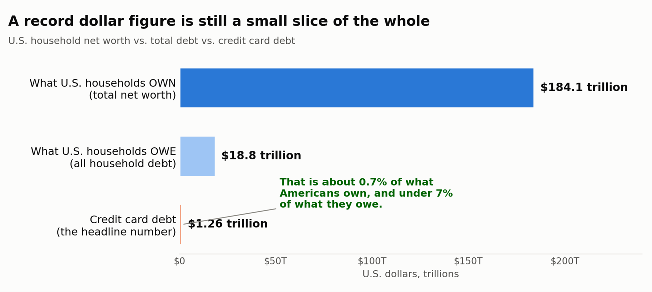
Sources: Federal Reserve Bank of New York (Q2 2026); Federal Reserve Financial Accounts of the United States (Q4 2025).
Divided by what?
A “record” in raw dollars is close to meaningless, because dollars go up almost every year. The economy is bigger, there are more of us, paychecks are larger, and prices are higher. Once you adjust for inflation, credit card debt is only roughly back to where it stood before the 2008 financial crisis.
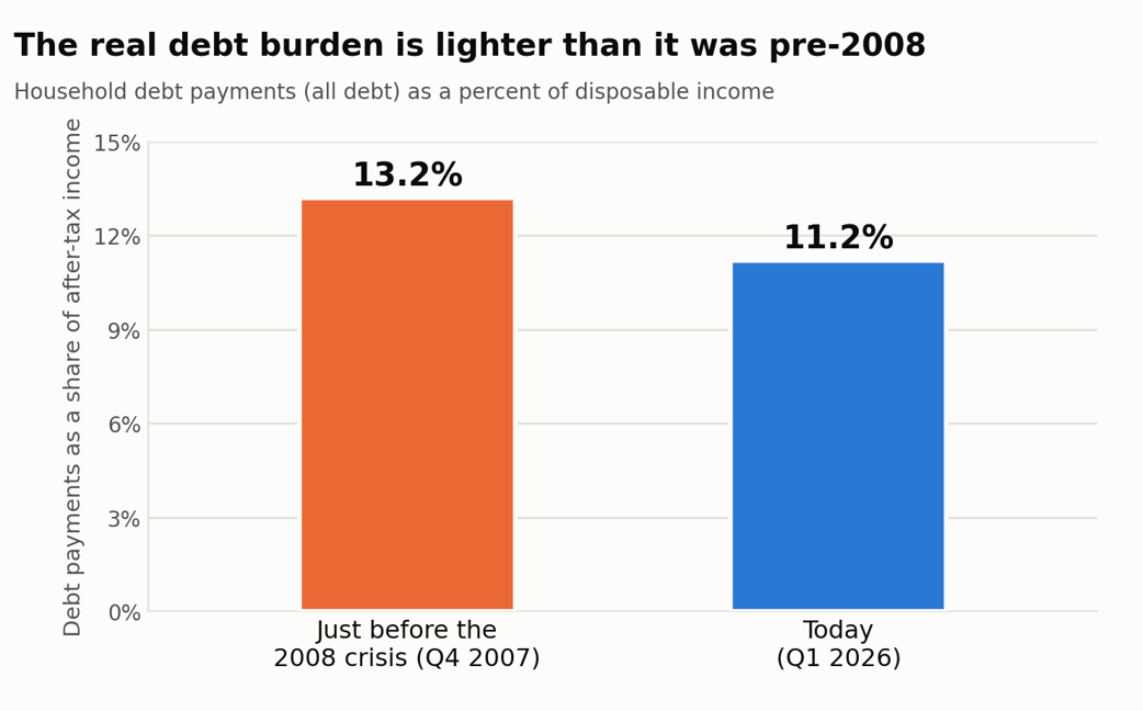
Source: Federal Reserve, Household Debt Service Ratio (all household debt as a share of disposable personal income).
Being factful is not the same as being relentlessly positive. It means looking at the data honestly, including the parts that are not cheerful. One of those areas is how uneven things are. The share of people falling behind on their cards has crept higher over the past couple of years and remains elevated, and card interest rates are sitting near 30%, which is punishing. Economists have started calling it a “K-shaped” split. Plenty of households are in great shape, and a smaller group is truly stretched. Which group you are in matters far more than the national total ever will.
The next time a record-breaking number lands in your news feed, take a breath and ask the two questions. Compared to what, and divided by what? More often than not, the answer is a good deal less frightening than the headline.
Happy Planning,
Alex
This blog post is not advice. Please read disclaimers.